
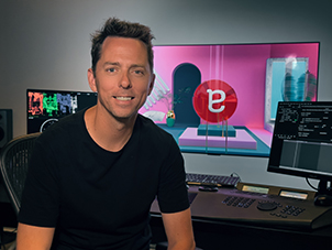
Meet The Colourist
Wade Odlum
Senior Colourist and Partner at alter ego, Wade brings a wealth of experience to his sessions after working around the globe in Australia, UK and Canada.
Wade was the recipient of the 2022 FilmLight Colour Award for Commercial grading, for his work on the ROM commercial Immortal. Here he talks to us about the challenges of that project, and his approach to colour.
Senior Colourist & Partner, alter ego, Toronto
Tell us about your journey to become a successful colourist.
I sort of fell into colour. It wasn’t something I knew a lot about when I first started in the industry, but I was always interested in cinematography and the techniques to bring images to life. When I was at high school and university, I interned at a post facility and I knew I had to learn what it was all about. When I got a job I spent many long days and nights in the colour suite learning everything I could from the colourists around me. And then any spare time I had outside of this was spent on the machine, honing my skills. Starting with film and then moving into digital gave me a great understanding of the process, how images work and where they could be pushed to.
Can you tell us how you ended up as a partner at alter ego? What makes the company different?
In 2008, not long after alter ego first opened in Toronto, I was working in the UK and the opportunity to work at alter ego came up. Eric Whipp was one of the founders and I knew him already from working alongside him in Australia. After a few years I was given the opportunity to become a partner in the company.
Alter ego opened in 2007 as a boutique colour and VFX house. Using Baselight from day one, we were the first non-linear commercial colour facility in Canada, and since then we have always aimed to lead both creatively and technically. We are consistently trying to find new ways to push the boundaries. We pride ourselves on our ability to create images in the colour suite that are as close to finished as possible. This involves picture clean-up, skies, flares, grain and various other comp elements to bring the creative’s vision to the screen. We have built a huge library of skies and FX that we have shot ourselves so that we have the right elements for every job.
Overall, there are a lot of similarities between the markets in the commercial world. I would say that the thing that I found the most different in Canada, from other places I have worked, is that the director isn’t as involved in the post process. This isn’t the same for all directors and all jobs, but often they are not around by the time it gets to us. We tried to combat this by building our own streaming service about 13 years ago, so that we could keep the director and DP more involved.
What type of content do you usually work on?
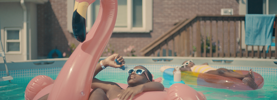
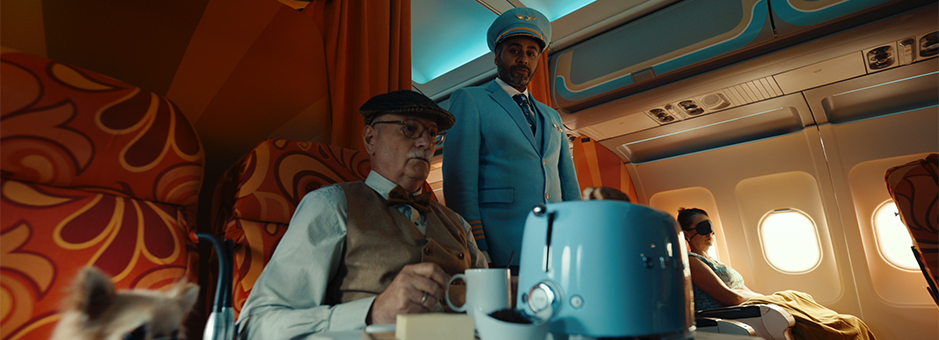
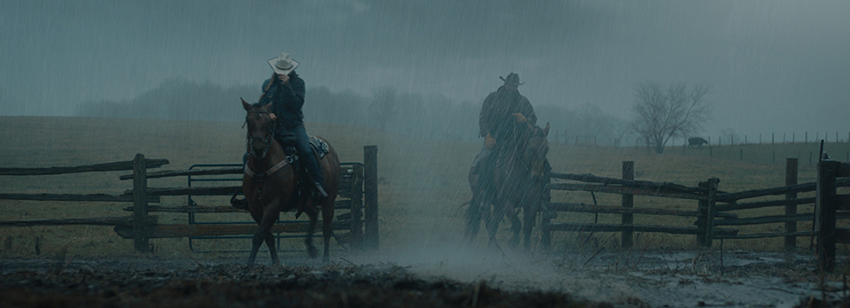
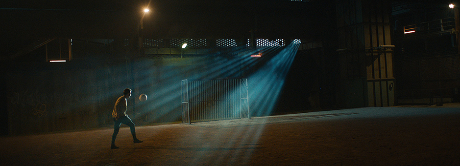
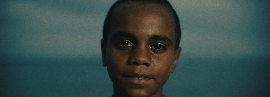
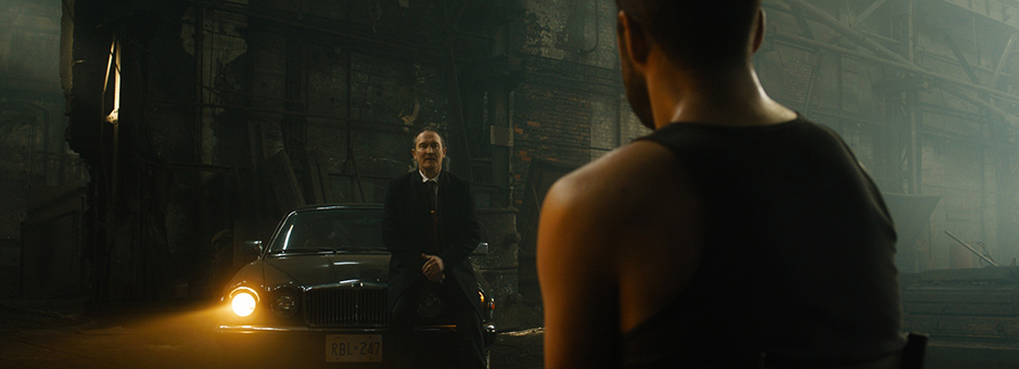
Most of my daily work is commercials for the North American market, but I also get to work on lots of music videos, short films, documentaries and features from around the world.
How do you think colour shapes the way an audience perceives film/TV?
Part art and part science is how I like to describe colour grading. Like in science, there are rules and values that are applied. But, like in art, it can also be about moods, emotions and experimentation.
A good colour grade should work with the cinematography, edit and sound to enhance the direction of a scene. In the case of a dramatic scene, it might be about shaping the light more to enhance the look in the actor’s eyes, or minimising the distraction so as to draw the viewer to the correct part of the frame. On the art side of things, it is very subjective. If a look is forced onto an image that distracts from the story, then I think it fails. It could be a great look, but if it doesn’t drive the story forward then maybe it’s not a good colour grade for the piece.
How can colour set the tone for a scene?
A great colour grade can either stand out or be almost invisible to the viewer. It can be a very powerful tool in the art of storytelling, but it really depends on what is required for the story. Sometimes the colour might need to drive the story and other times it might need to appear simple so that it doesn’t take the viewer out of the moment.
How long have you been grading on Baselight and what is your favourite thing about the system?
It’s been 15 years now since I started using Baselight and I am still finding new ways to use the tools. I love that Baselight is designed first and foremost with the colourist in mind, and when we ask for new tools or have any feedback it’s quickly addressed.
How does Baselight/FilmLight support your role as a colourist?
It allows me to work quickly and efficiently by concentrating on the creative and not worrying about whether I can achieve the look due to lack of tools.
What’s your career highlight to-date?
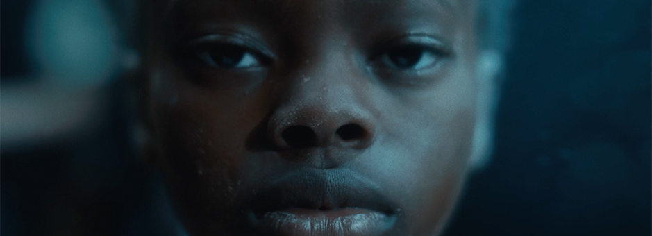
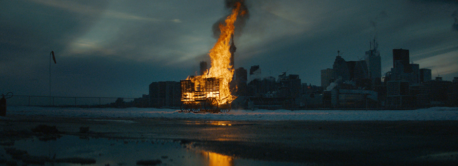
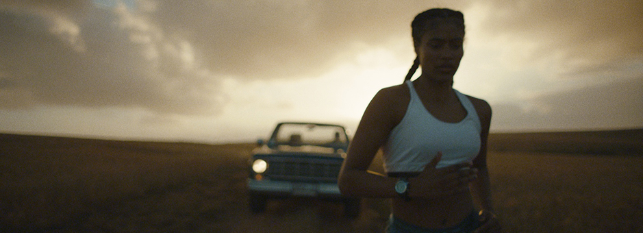
I’ve been fortunate enough to be part of some great projects over the years – from award-winning commercials to a short that turned into a feature and then into a sequel. It’s hard to choose between them, but it would probably have to be the Royal Ontario Museum’s “Immortal” commercial last year that won awards all around the world for the agency, director and editor.
It was also a finalist for colour at award shows in Europe and North America and it won me the FilmLight Colour Award for best commercial grade at EnergaCAMERIMAGE in Poland. The other spots that were short listed in the commercial category were amazing, so it was a great honour to be recognized for such a great project amongst them.
I’ve worked with the director, Mark Zibert, many times before and he’s very aware of what we can do in the colour suite. He asked me to experiment with how I could help to compliment the underwater look that they would be shooting. We developed the look first by setting the overall colour tone for the underwater world. We didn’t just want everything to be washed blue, but at the same time it couldn’t have too much colour or skin tone, as red is the first colour to disappear under water. As almost the entire piece was shot in a large studio, dry for wet, we then started adding in layer upon layer of FX to really bring the look to life and add the watery feel. There are multiple layers of dust particles, bubbles, caustics, heat haze and flares. On some of the shots we also added additional elements such as sparks and lightning.
What were the key challenges in this project?
The biggest challenge was in finding the right balance between pushing the look far enough to help with the story and the underwater feel and making sure it didn’t take over and become distracting.
You have joined the jury for the 2023 FilmLight Colour Awards. What are you looking for in entries?
There are so many talented colourists doing amazing work all over the world and I’m really looking forward to seeing their entries. As for what I’ll be looking for, I like to see looks that really compliment the story. It could be extreme or subtle, but it needs to help move the story forward.
How do you like to collaborate with the director and DoP on a project?
I love to work with directors and DoPs on all projects, as they are the ones responsible for the images I get to work with. I want to know what their intention was and how I can help them to enhance what was shot. When I get the opportunity to talk to them before the shoot, we are able to talk about how colour can work with them. Sometimes it might be creating a unique LUT that works for a specific look or talking about things that can help them save time on set because of the tools and tricks we have in colour.
What do you like to do outside the grading room?
When I’m not in the colour suite I love watching all the great movies and TV shows around. If I’m not doing that I love to get outside and get some much-needed sun and fresh air!
There are several commercial and longform projects coming up in the next few months that I’m excited about as well as couple that we have just finished that will be launching soon. I’m always looking for the next challenging project to be a part of, no matter what it is or where it comes from.
Join In
If you want to participate in our MTC programme, we'd love to hear from you. Contact:
Alexa Maza
e: [email protected]
“A great colour grade can either stand out or be almost invisible to the viewer. It can be a very powerful tool in the art of storytelling, but it really depends on what is required for the story.”
Details
Colourist: Wade Odlum
Role: Senior Colourist & Partner
Web: alter ego