Meet The Colourist
Jennifer Mendes
Colourist, Loudness Films, Portugal
Jennifer Mendes is a colourist at Loudness Films in Portugal, best known for her work on Os filhos do Rock (2013), Capitão Falcão (2015), O Patio das Cantigas (2015), and most recently Gloria (2021).
Mendes started working in the audio-visual industry as a motion designer and VFX compositor. She’s been a colourist for 11 years and has worked on a variety of content including commercials, music videos, documentaries, as well as features films and TV. Mendes loves to work in different colour spaces and is passionate about creating rich, vibrant, and dynamic colour palettes that bring life to her projects.
Can you tell us about your journey to becoming a colourist?
I was looking for a job as a motion designer when Loudness Films opened its doors in 2011. My (now) boss was opening an audio and image post-production studio in Lisbon and they wanted someone to manage the colour correction suite. They made me the proposal and I went to experiment to see if it was a good fit for me.
My first project was a documentary series. I remember walking into a room of five or more people who were focused on me and what I was doing. I didn’t have any experience, but I passed. I took some courses and projects continue to emerge up until this day.
Tell us about your role at Loudness Films.
Loudness Films is an audio and image post-production studio. We have image and audio editing rooms, a Foley recording studio, a Dolby Atmos studio and a colour correction room. We work on all kinds of projects, but mostly our focus is feature films and TV series. I started to do a little bit of everything, but right now I’m dedicated to colour correction work.
How would you describe the post-production industry in Portugal?
The post-production industry in Portugal is not very big and there are few post-production studios here. In comparison to neighbouring countries, the industry does not benefit from incentives and subsidies and national productions do not have large budgets.
However, the post-production house in Portugal has a high level of technical expertise and offers a huge range of services in film and video editing, visual effects, colour grading, sound design and animation. And it’s in constant development according to the needs of the market. I think that more and more producers are taking advantage of the country’s competitive cost structure and its talented pool of professionals.
How does Baselight aid your role as a colourist?
When I started using Baselight, about five years ago now, I had a year with a lot of work and it would have been a much more challenging time if it wasn’t for this system. The Baselight ASSIST helps to maximise efficiency as it allows someone to do the conforming and rendering work in the background while I focus on the colour work with the clients. The internal cache is also very important as it allows us to read the footage in real time while we are working. The option to have several projects open at the same time, or to have the thumbnails on the second monitor and to be able to quickly copy grades, helps a lot – especially in episodes or between reels to maintain the consistency of the look across the episodes or film.
What’s your career highlight to-date?
I think it was the opportunity to do colour correction in HDR for the first Netflix original series in Portugal, Gloria (2021).
And also a comedy film that is part of a trilogy of remakes, O Patio das Cantigas (2015), which was until today the most watched Portuguese film at the box office in Portugal.
How do you think colour shapes the way audiences perceive film?
Colour plays a crucial role in shaping the way audiences perceive film. The choice of colours and contrast can set the tone for a scene, convey the mood and emotions of characters and even help to advance the plot. For example, warm colours like red and orange can create a sense of excitement and energy, while cool colours like blue can evoke a sense of calmness and tranquillity.
In addition, colour can also be used to create visual symbolism, by using a particular colour to represent a specific theme or idea. For example, the colour green might be used to symbolise growth and renewal, while the colour black might symbolise death or mourning.
Colour is a powerful tool in filmmaking that can greatly impact the way audiences perceive and experience a film. The use of colours can enhance the visual impact of a film, but like Ivan Albright once said: “a colour is as strong as the impression it creates.”
How have you used colour to communicate with an audience?
As a colourist, one of the ways we can communicate with an audience is through the use of colour and contrast. Colour and contrast can evoke emotions, set the mood and create a visual style that supports the storytelling – enhancing the overall impact of the film.
Colourists can communicate with audiences by using colour to create a visual style for a film and help to establish its overall tone and mood. For example, in the film Bem Bom, which is set in the 1980s, we use a warm tone and vintage look. Colour can be used to support the story and help the audience understand the mood and tone of a scene. If a scene is meant to be tense or suspenseful, for example, the colourist might use a desaturated, high-contrast look to create a sense of unease.
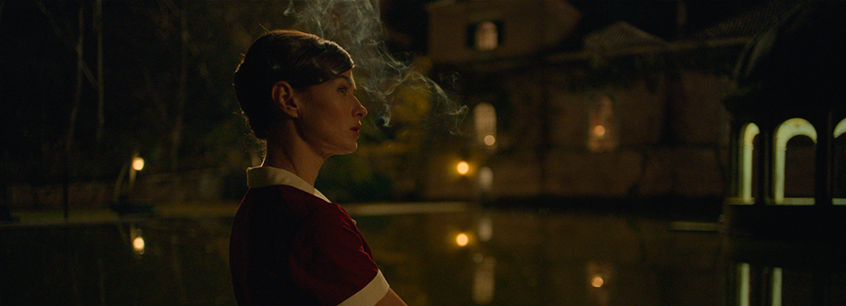
In Gloria there is a romantic beach scene where two characters, woman and man, go to the beach. We used colour here by adopting a desaturated tone, to create more suspense between the characters' relationship.
In my opinion, a colourist can effectively communicate with an audience and help bring the director's vision to life.
How do you like to work with the director and cinematographer?
I like to work closely with the director and cinematographer to ensure that the visual look and feel of the film aligns with their vision. I think working with them from the very beginning of the grading process is essential for the colourist. It enables you to follow the shooting concept and to ensure that the final product meets the director's and cinematographer's expectations – and helps to enhance the overall storytelling of the film.
When possible, I like to start by reviewing the film/episodes and discussing the goals with the director and cinematographer. We might also create some initial grades together, to find the best mood, tone, and the overall visual style.
After that, it is important for me to spend some time working alone, to match the footage. This then allows the director and cinematographer to have a more objective look at the review of the work in progress, provide feedback, and make adjustments as needed.
All productions are different and I adapt to the needs and preferences of customers.
Can you tell us a bit about your work on Gloria?
Working on the Gloria series was challenging as it was the first time I worked in Dolby Vision HDR, one of Netflix's delivery requirements.
My journey with the series started before the colour correction phase, where I had to upgrade my reference monitor to an HDR monitor. I participated in two training sessions on HDR, including one specifically on Dolby Vision’s technical requirements. And I also received a lot of help from the FilmLight support team, who helped to set up the project and provide technical tips for HDR.
With the production I only got involved when the shooting of the series ended. I had a working day with the director of photography where we discussed the idea for the series and did image tests for the look of the series, so when I started working on the first episode I already had some references, to guide the grade.
Can you tell us how you approach colour grading for episodic in comparison to feature?
The approach to colour grading for episodic content and feature films can be quite different. To me the difference starts at a technical level – the colour spaces are different and the workflow, too.
In my opinion, I think it’s also important to remember that a film is made for the big screen in a cinema, while a TV series is made to be viewed at home on a television. The visual style of a television series should be clear, bright, and visually appealing. It’s also important to maintain a consistent look across episodes to keep the audience engaged and ensure we’re not compromising the viewers' experience throughout the episodes.
We should also take into account the time we have to work on each episode, which is usually less than on a feature film. Time constraints are often a factor when working on episodic content, as deadlines can be tight and multiple episodes may need to be completed in a short period of time.
With feature films, colourists tend to have more time and opportunity for creative freedom and experimentation and can create a more complex grade.
But of course, it all depends on the type of project and production. Both episodic content and feature films require a colour approach that depends on the specific requirements and goals of the project. Every project is different and I always collaborate with the director and cinematographer to ensure the final image meets their visions and expectations.
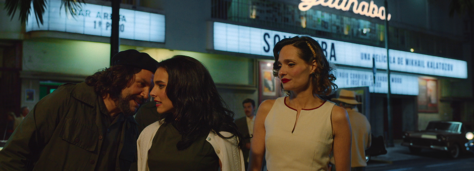
How did you achieve the look on the TV series, Cuba Libre?
I always like to talk to the director and the director of photography to understand the idea and concept. For me, the look starts with the type of project. For example, if it's a comedy or a drama the look can be quite different. The look starts with the production, it starts with decor, clothes, skin tones and hair colours of the actors and actresses.
On Cuba Libre, the look was achieved mostly with the director and the cinematographer, who was already working on another project, was approving the episodes remotely. Before starting the first episode, the director and I reviewed the edited episodes together. We talked about the colour ideas for the scenes, we did some tests on the footage to gain an understanding of the desired look and feel of the series.
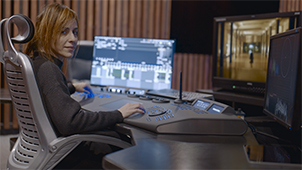
Can you tell us about your grading suite? What could you not be without while at work?
In my grading suite I use Baselight with the Blackboard classic control panel. I have an Flanders Scientific HDR monitor for TV work and a Barco 2k DCI projector for feature film work.
My room is connected to a Baselight assist room, where we share the storage to perform the conforming and rendering. This helps me to focus more on the creative part of my job.
I could not imagine myself working on another grading system. I could not be without Baselight while at work.
What are you working on now/next?
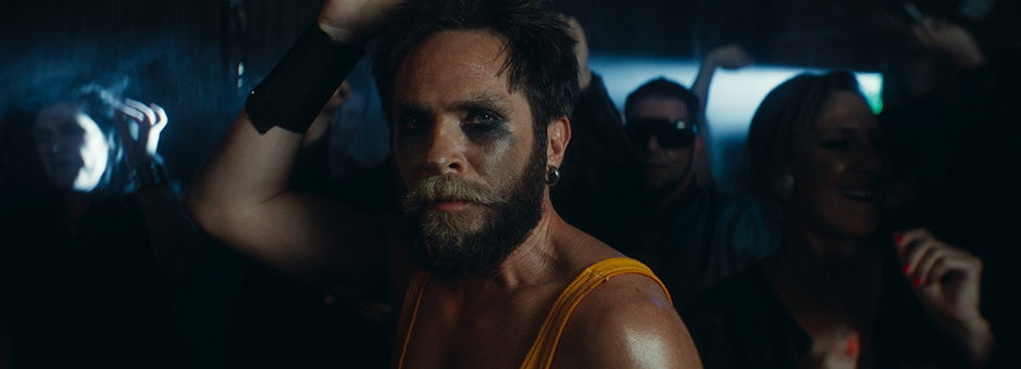
I am finishing a feature film Amelia’s Children and I have just started to grade on HDR, a Portuguese/Brazilian co-production TV show for Globoplay streaming platform called Codex 632.
Join In
If you want to participate in our MTC programme, we'd love to hear from you. Contact:
Alexa Maza
e: [email protected]
“When I started using Baselight, I had a year with a lot of work. It would have been a much more challenging time if it wasn’t for this system.”
Details
Colourist: Jennifer Mendes
Role: Colourist
Web: Loudness Films