Case Studies
Grading Chespirito: Sin Querer Queriendo
See: ENGLISH | ESPAÑOL
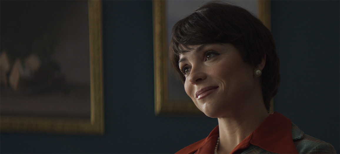
Chespirito: Sin Querer Queriendo (Chespirito: Not Really on Purpose) is a popular Mexican series featuring eight episodes that aired between 5 June and 24 July 2025 on Max (formerly HBO Max). It tells the story of comedian Roberto Gómez Bolaños, better known as Chespirito.
The series was directed by Julián de Tavira, Rodrigo Santos, and David “Leche” Ruiz, and shot by cinematographers Marc Bellver and Diana Garay. The colour grade was completed by Fernando Medellin, head of colour at Oxido.
From pre-production to final look
“The series required a very specific visual design, as it spans five decades, explains Medellin. “For this reason, Marc Bellver, the director of photography, contacted us during pre-production to discuss his vision for the project and share some references. This allowed us to start creating and testing a show LUT for each of those eras.”
“The main director and showrunner was Julián de Tavira, and this was our first project together,” adds Medellin. “I have collaborated with Marc (DoP) on several projects over more than 20 years.”
“We worked through pre-production, production, and post-production, fine-tuning and perfecting the visual look in the colour suite. In addition, especially at the start of filming, I was in contact with Françoise Nobecourt (DIT), who helped us maintain the look’s continuity from the set through CDLs.”
Creating the look of five decades
The team began by reviewing references to conceptualise and plan how they would achieve their visual goals for the series.
“We set out to distinguish each of the five decades, defining the visual style of each one based on these references, and thus developing a unique identity as we progressed in our work with the LUTs,” explains Medellin.
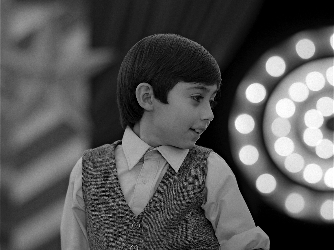
“For the 1930s, we used a black-and-white LUT, in a 4:3 format, with MasterBuilt SF spherical lenses, achieving a softer, more textured image.
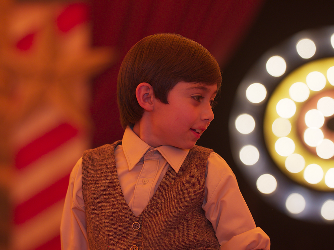
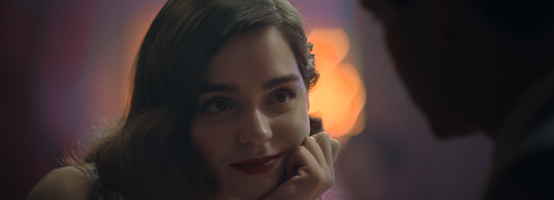
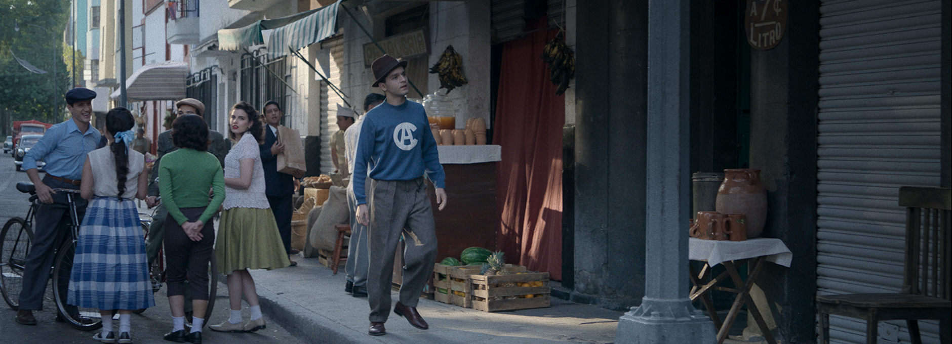
“For the 1950s, we designed a LUT with bluish shadows to enhance green and light blue art elements, and we switched to a 1.66:1 aspect ratio.
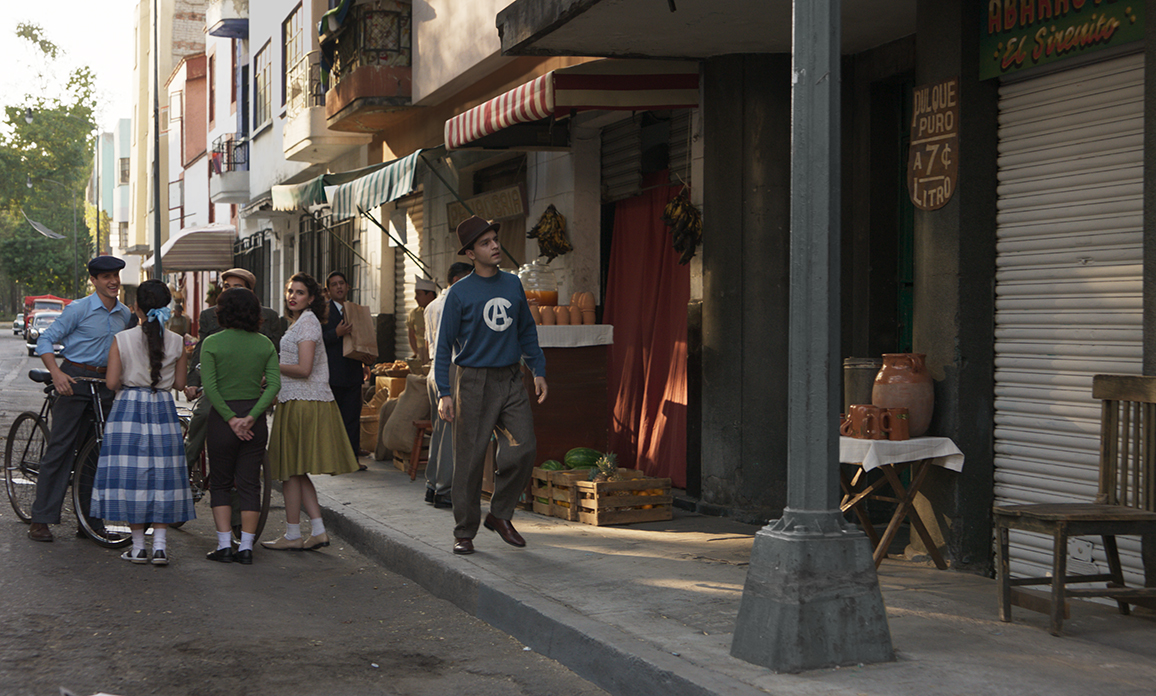
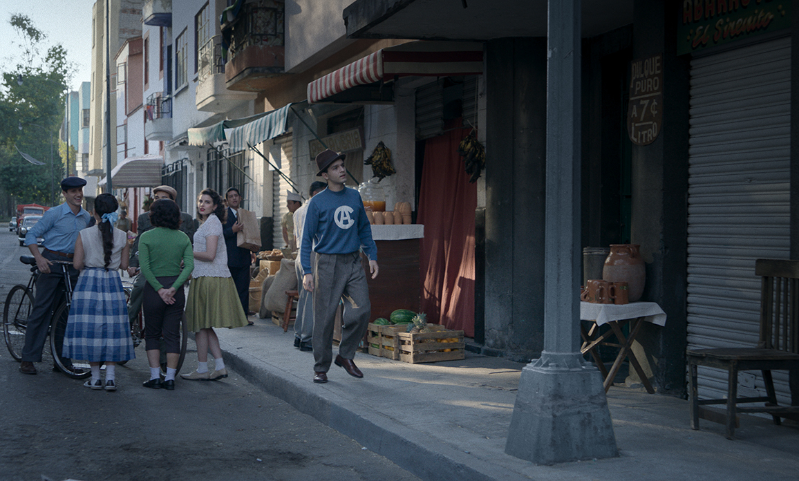
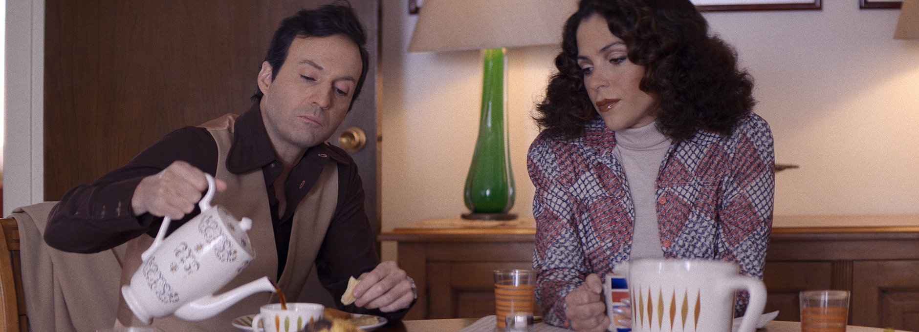
“In the 1960s and 1970s, also using MasterBuilt SF lenses, we felt the aesthetic difference between these two decades was not so pronounced, so we created a single LUT with a warmer tendency, favouring more saturated and vivid colours to emphasise the vibrant creativity of the era.
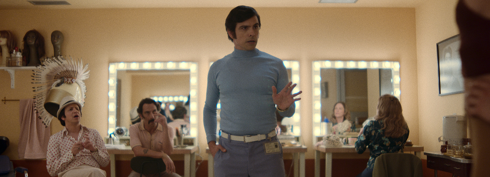
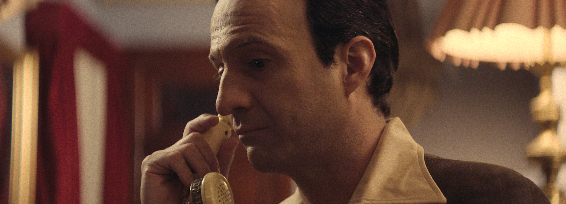
“The last decade portrayed in the series is the 1980s. As it represents the present narrative, it was shot in a 2.20:1 format with Hawk V-Lite anamorphic lenses. For the LUT, we aimed for intense colours and added a magenta touch to the shadows, giving the scenes their own personality and a sense of modernity.”
The entire shoot was monitored using the show LUTs as a base, with further adjustments made on set through CDLs.
Creating LUTs and tools in Baselight
“I have been working with Baselight for 22 years, and from my perspective, it is the best tool for colour grading,” says Medellin. “In addition to all the functions it offers for creating LUTs and looks, as well as exporting them in different formats for use in various software and devices, it has operators that allow you to work with colour in depth, with complete creative freedom, without sacrificing image quality in the final result.”
“To build the LUTs, I started with a film stock emulation through the LUT operator, which I customised using Film Grade, Base Grade, Hue Shift, and Video Grade,” says Medellin. “For the colour grading, in addition to these tools, I also worked with Colour Temperature, X Grade, DKey, Hue Angle, Curve Grade, as well as some Shapes combined with Face Track, and a few others.”
“The combination of Baselight’s tools allowed me to precisely achieve the image look we had envisioned when planning the visual style for the series,” concludes Medellin.
Visually rich
“One of the key challenges was achieving consistency, both technical and aesthetic, throughout the entire project,” says Medellin. “Each sequence had its own demands and unique personality.”
“The biggest challenge though, without a doubt, was finding the right visual style for each era — colour, contrast, texture, grain, and so on,” adds Medellin.
“Much of the visual intention was defined in-camera. This, combined with the pre-production work at Óxido in the colour suite, using Baselight’s tools, resulted in a product that was not only technically correct but also visually rich.”
“Baselight has operators that allow you to work with colour in depth, with complete creative freedom, without sacrificing image quality in the final result.”